
Responsive Design
Today people are viewing content online on a variety of different mediums, these include things like phones, tablets, laptops and TV’s. Responsive design is what makes the website fit all these different types of screens and provide a consistent experience across all displays.
Elements of a responsive design
Optimised images– As the web is visited by many different users across the world with various internet speeds, it may be advisable to use smaller images and not use things like GIFs and animations that may take longer to load on the website and cause the user to close the site.
Images should also be able to adapt to the size of the screen, they should expand when being viewed on a laptop or TV and should contract if being viewed on mediums such as a phone or tablet.
Compatibility– websites should be able to be displayed on various sites such as a laptop or a phone, there should be no reason for the user to zoom into the website on a phone so they can see it. The website should change its style depending on the type of screen it is being used on.
Importance of Responsive Design
Reachability– as the website is able to adapt to the screen size, it allows the website to be accessible and usable to people using all types of device instead of just one type of device.
User Experience
As the website will be able to adapt to a 5 inch phone screen or a 50 inch monitor screen it means that the user is able to get the exact same experience from the website whatever device they decide to use.
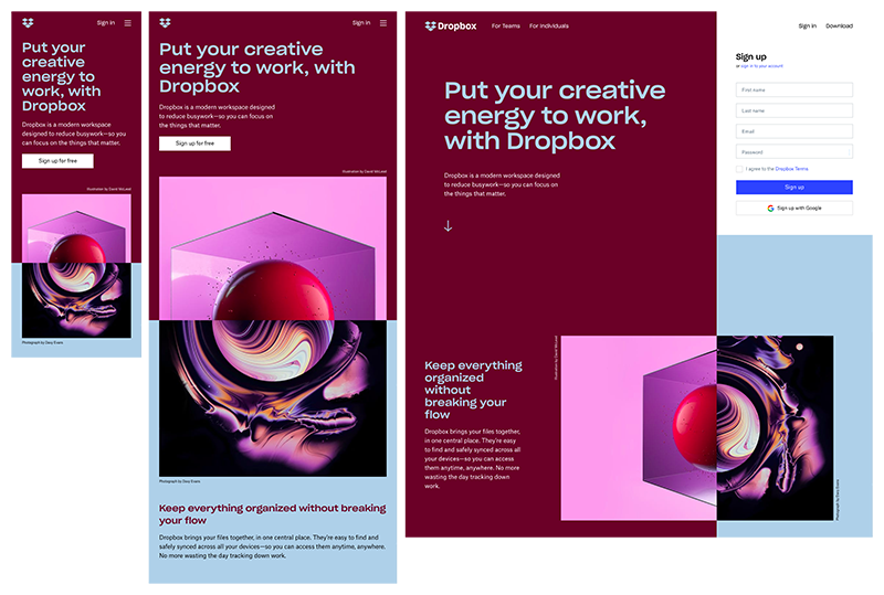
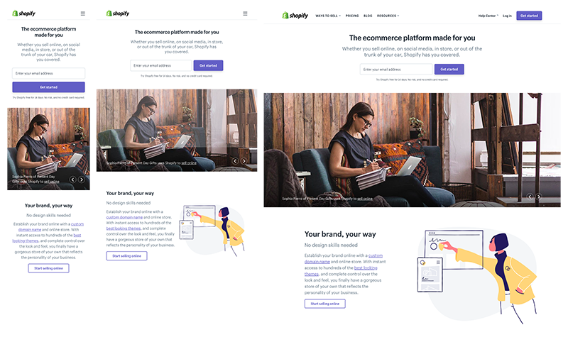
Examples of good responsive design
Mistakes in responsive design
Most of the mistakes seen when it comes to responsive design typically resolves around not supporting smaller devices, these include.
Image load time
Smaller screens take longer to load and if the site is not optimised for a smaller screen, this can cause increased load time for the user, which can cause annoyance for the user and they may not come back.
Mobile menus
Often when mobile menus are created using the same menu items as bigger displays, they often look cluttered and crowded. It is better to simplify and clean up a menu when using a mobile display
Responsive Design Trends
Mobile first sites- developers are focusing on creating sites for mobile and smaller screens first and then scaling upwards for larger screens.
Mobile Friendly
Making sites more mobile friendly by allowing more clickable aspects to the site and creating bigger boxes for items so people don’t accidentally click something else.