Navigation Bar
Why Is Navigation Important?
Navigation is the backbone of every website, its how you easily get from one thing to another, from point A to point B..
Navigation on a website allows the user to easily find their way without spending loads of time trying to find it and eventually giving up.
Best Practices for Navigation.
Readability– Its important to keep the navigation bar on a website readable to the user, the nav bar must be accessible to the user from the very beginning, the nav bar should be easy to read. it should also be a colour that fits the colours of the website and the font should be legible and a size and colour the user can read and understand easily
Consistency- as users often use a nav bar to go back to something they start to become more familiar with. When users are lost or confused they return to the nav bar, it is important when creating a navigation bar to be consistent with it and not have different nav bars on different pages to further confuse and upset the user.
Types of Navigation
Primary Navigation- this is often typically at the top of the website. This usually includes items such as “About us”, “Contact” ,“Gallery” and “Services”, this is often a users first port of call when trying to navigate the website.
Secondary Navigation– secondary navigation is typically displayed at the bottom of the website. This typically includes things like “FAQ”, “Shipping” and “privacy policy”, this allows users to find important but les urgent information on the website.
Footer Navigation- Footer navigation allows the user to find links in the footer of the website, this is usually for items such as social media links and contact links. Typically this is the last place of navigation for a user.
Examples of good navigation.


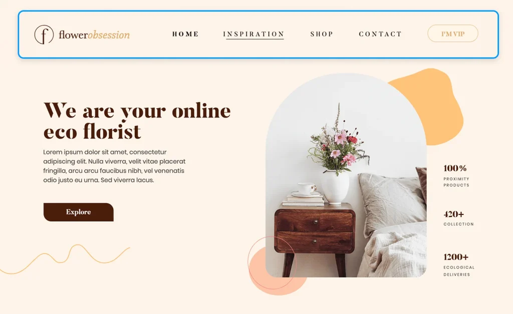
The website above uses a nav bar as its primary navigation well as it allows the user to easily find what they are looking for. The navigation bar is simple, clean and pops out to the user, which allows the user to quickly and easily find what they want.
Mistakes used in website Navigation
Cluttered menus– navigation can be cluttered and have too many options for the user to chose from, this can overwhelm the user as they wont know where to go, having a smaller number and less cluttered navigation is better for the website and the user.
Naming- labels for navigation links can be called “Misc” “other” “Stuff”. This is very unclear and does not give the user a clear idea of what is behind the link.
Too many options- Giving the user too many options can confuse the user and leave them not knowing where to go for what they are looking for.
Navigation Trends
Hamburger Menus.
Over the last few years there has been a few changes to how we navigate on a website, as a lot more people are using mobile phones to navigate and surf the web, hamburger menus have become popular on mobile sites and apps, as they allow users to browse comfortably on smaller screens without crowding the interface.

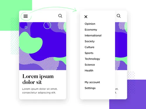
The above is an example of a hamburger menu and how it can be used for smaller screen devices to create a clean and uncluttered navigation experience for the user.
Sticky Menus.
Sticky menus, as the name suggests, stick to the top of the website so no matter how far you scroll the navigation bar will always pop up for you to access and use. This trend enhances accessibility, especially on content-heavy sites.
Good navigation on a website allows the user to find information effortlessly. A user should feel at home and comfortable on a website. By following good navigation practices a website can be created that users want to revisit and use again and again.
